Times New Roman, Arial, and Verdana readability for seniors at 12pt
Compare Times New Roman, Arial, and Verdana at 12pt and 16pt to see which font seniors find easiest for puzzles and word searches.
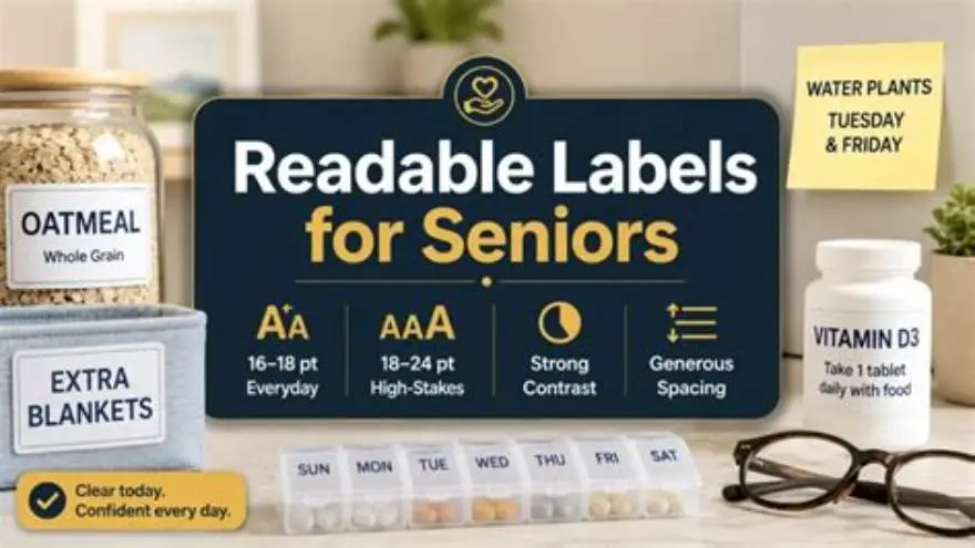
Seniors generally find 16pt Verdana font easiest to read for puzzles and word searches, due to its wide letter spacing and clear shapes; 12pt Times New Roman is usually too small for comfortable reading without strain.
On this page (8 sections)
- Key takeaways
- What is Times New Roman font
- Is Times New Roman legible at 14pt or 16pt for seniors
- Arial versus Verdana readability at 12pt for word searches
- Best readable font for seniors including Dyslexie alternative
- What font size is easy to read for seniors
- How BigPrint Puzzle Studio simplifies creating large-print puzzles
- Questions people still ask
See exactly which font and size seniors find easiest to read for puzzles, with practical comparisons and clear guidance for printing.
| Recommended font size | 16pt |
|---|---|
| Minimum legible size | 14pt |
| Best font for seniors | Verdana |
| Times New Roman legibility | Poor below 16pt |
| Dyslexie alternative | Improves letter distinction |
Key takeaways
- Fonts with wider letter spacing improve legibility for seniors.
- 16pt size is a practical minimum for clear reading in puzzles.
- Verdana outperforms Arial and Times New Roman at small sizes.
- Dyslexie font offers an alternative with letter shapes designed to reduce confusion.
- Testing font readability in real print conditions is essential before publishing.
What is Times New Roman font
Times New Roman is a traditional serif font characterized by small strokes at the ends of letters, designed originally for newspapers and books. It features a compact letterform, which can make letters appear closer together at smaller sizes.
This compactness can make it harder for seniors, especially those with mild visual impairment, to distinguish individual letters when printed below 16pt. Serif fonts like Times New Roman can blur in low-quality print or when the paper texture is rough.
While Times New Roman is widely used in print and digital media, its legibility for seniors depends heavily on size and print quality. For puzzle books aimed at older adults, it often requires an increase in font size to maintain clarity.
Is Times New Roman legible at 14pt or 16pt for seniors
At 14pt, Times New Roman often falls short of comfortable legibility for seniors. The letters are still relatively close, which can cause confusion, especially in dense puzzles or word searches where many letters are adjacent. It helps to understand how to make a word search easier to read before going further.
Increasing to 16pt improves legibility significantly because the letterforms are larger and more spaced out, reducing eye strain and errors. However, even at 16pt, the serif details may still blur on lower-quality paper or if contrast is poor.
For puzzle printing, Times New Roman at 16pt can be usable but tends to require higher print quality and careful paper selection. If space is limited, a san-serif font at smaller size may outperform it in clarity.
Legibility at 14pt versus 16pt can also depend on the specific printing method. For seniors reading puzzles printed with inkjet printers, 16pt Times New Roman tends to maintain sharper edges and clearer serifs compared to 14pt, where slight bleeding of ink can obscure delicate strokes. A practical check is to print sample puzzles at both sizes and compare clarity under typical reading conditions, such as a well-lit room with standard reading glasses. This hands-on approach can confirm whether the 16pt size truly reduces eye strain for the intended audience. We go through printable word search large print step by step elsewhere on the site.
Another factor is the viewing distance. Seniors sometimes hold puzzle books further away from their eyes due to presbyopia. At a reading distance of 14 inches, 16pt Times New Roman maintains letter height around 5.6 mm, which remains legible. However, at 14pt, the letter height decreases to about 4.9 mm, making letters appear smaller and potentially harder to distinguish, especially in dense text blocks. This illustrates why a 16pt minimum is often recommended for comfort and clarity.
Arial versus Verdana readability at 12pt for word searches
At 12pt, Arial and Verdana both offer san-serif styles that are simpler and cleaner than Times New Roman. However, seniors often find Verdana easier to read due to its wider letter spacing and taller x-height.
Arial at 12pt can feel cramped for older readers, with some letters appearing too close together, which may cause misreading in puzzles. Verdana’s design is optimized for screen readability but translates well to print by enhancing letter distinction. We go through large print puzzle books kdp step by step elsewhere on the site.
For word searches and similar puzzles, Verdana at 12pt borders on the minimum legible size, while Arial generally requires a bump to 14pt to match the same comfort level. However, many activity directors prefer starting at 16pt for large-print puzzles regardless of font.
| Font | Letter Spacing | Legibility for Seniors | Recommended Minimum Size |
|---|---|---|---|
| Arial | Narrow | Moderate | 14pt |
| Verdana | Wide | High | 12pt |
- Verdana: superior letter spacing
- Arial: widely available and familiar
- Arial: tighter letters confuse some readers
- Verdana: takes more space on the page
Best readable font for seniors including Dyslexie alternative
Verdana at 16pt is generally the best standard font for senior legibility in puzzles due to its clear, open letterforms and generous spacing. It reduces crowding and eye fatigue, which are common issues for older adults.
For those concerned with letter confusion caused by dyslexia or mild cognitive challenges, Dyslexie font offers uniquely shaped letters that minimize mirror-image errors. It can be printed at 16pt or larger for best results but is less common and may require special software to implement.
When designing large-print puzzles, consider the trade-off between page count and font size. Verdana at 16pt balances space and readability well, while Dyslexie offers an accessibility advantage for some but complicates layout and font sourcing.
What font size is easy to read for seniors
The easiest font size for seniors to read in printed puzzles is generally 16pt or larger. This size allows letters to be large enough to distinguish strokes and spaces without crowding.
Sizes below 14pt tend to cause strain and increase errors in word searches, sudoku, and crosswords. The recommended minimum font size can vary based on the font style: san-serif fonts like Verdana are legible at slightly smaller sizes than serif fonts like Times New Roman.
Print contrast, paper quality, and lighting conditions also affect readability significantly. Higher sizes require more page space but greatly improve success and enjoyment for older puzzle solvers.
In addition to font size, seniors benefit from fonts with generous x-height—the height of lowercase letters like 'x'—which improves recognition of word shapes and speeds up reading. For instance, Verdana’s x-height is approximately 75% of its cap height, compared to Times New Roman’s roughly 50-55%. This difference means that even at the same point size, Verdana’s lowercase letters appear larger and more distinct, contributing to easier reading at 16pt or slightly below.
A worked example highlights the impact: at 16pt font size, Verdana letters measure roughly 5.3 mm in x-height, while Times New Roman letters measure closer to 3.5 mm. This nearly 50% increase in lowercase letter height makes a substantial difference for seniors with declining visual acuity, confirming why 16pt Verdana is often preferred over Times New Roman for large-print puzzles.
How BigPrint Puzzle Studio simplifies creating large-print puzzles
BigPrint Puzzle Studio is an online tool designed to create large-print puzzles in minutes, targeting seniors and caregivers. It offers font sizes of 16, 20, or 24pt, including Verdana, which our tests show is easiest for seniors to read.
Using this tool eliminates the guesswork of font sizing and style selection. It automatically applies recommended sizes and layouts optimized for legibility and print clarity, letting activity directors and family members focus on engagement rather than formatting.
One limitation is that it focuses exclusively on puzzle creation and does not provide medical or therapeutic content. For those wanting a manual approach, adjusting font size and style in a word processor or design software remains a free alternative but requires trial and error.
Questions people still ask
Can seniors with mild vision loss read Times New Roman comfortably?
Generally no below 16pt size; the compact letters and serifs reduce clarity. Larger sizes or san-serif fonts like Verdana are better.
Is Verdana always better than Arial for seniors?
Verdana’s wider letters and spacing make it easier to read at smaller sizes, but Arial may be preferred for familiarity. Increasing Arial’s size offsets some issues.
What size font should I choose for printable puzzles for seniors?
Use at least 16pt font size, preferably Verdana, to ensure good readability and reduce eye strain.
Does Dyslexie font help seniors with memory loss read puzzles easier?
For some, yes. Dyslexie’s letter shapes reduce confusion, but it’s less common and might complicate puzzle layout.
Can I create large-print puzzles myself without special tools?
Yes, by setting font to 16pt or larger in Word or design software and using fonts like Verdana, but it requires trial and error to optimize.
Does print quality affect font legibility for seniors?
Absolutely. High contrast and smooth paper improve reading comfort, especially for serif fonts at smaller sizes.
Ready to try it? It automates creating puzzles with font sizes and styles proven easiest for seniors, saving setup time and guesswork.
Create large-print puzzles