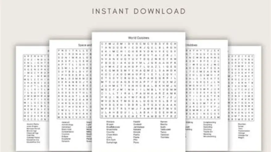
Word search readability: Verdana 20pt plus dyslexia font and contrast tips
Use 20pt Verdana or Dyslexie font with high contrast settings to make word searches easier to read for seniors and those with dyslexia.
To make a word search easier to read, use Verdana font at 20pt size, apply dyslexia-friendly fonts like Dyslexie when needed, and print with high contrast, such as black letters on a white background, to support seniors and low vision.
On this page (9 sections)
- Key takeaways
- Verdana 20pt word search templates for seniors
- Dyslexia friendly high contrast word search print settings
- How to add Dyslexie font to Word
- Printed contrast and paper choices for easier word searches
- How to adjust puzzle grid size to match large fonts
- How to make a word search easier to read
- Using BigPrint Puzzle Studio for accessible word searches
- Questions people still ask
Part of our guide on large print word search for seniors
| Recommended font size | 20pt |
|---|---|
| Common font for seniors | Verdana |
| Contrast setting | Black on white |
| Dyslexia font | Dyslexie |
| Puzzle grid size | Adjust for big print |
| Print paper | Matte preferred |
| Template type | Large-print word search |
Key takeaways
- Verdana 20pt font improves clarity and readability for seniors
- Dyslexia-friendly fonts reduce letter confusion and fatigue
- High contrast (black on white) makes letters stand out clearly
- Manual font installation allows use of Dyslexie in Word documents
- Template and print settings greatly affect puzzle legibility
Verdana 20pt word search templates for seniors
Using Verdana at 20 points provides a clear, readable font size that suits most seniors' vision without overwhelming the page. Verdana's wide letter spacing and simple shapes reduce eye strain and letter crowding, which is common in word searches with smaller fonts.
Templates designed with 20pt Verdana usually fit a grid of about 12x12 letters comfortably on standard 8.5x11 inch paper, leaving ample white space around words. The grid size depends on word list length, but increasing letter size demands fewer words per puzzle or larger pages.
If you create your own puzzles, start with a 12x12 grid in 20pt Verdana and print a sample page to check readability. Seniors often prefer puzzles with clear separation between rows and columns, so adding light gridlines or spacing helps letter distinction.
Dyslexia friendly high contrast word search print settings
High contrast print settings matter more than font choice in many cases. A black on white contrast ratio ensures letters stand apart sharply, reducing visual blur and fatigue. Avoid colored backgrounds or pastel shades that lessen contrast. There is more on simple puzzles with large font in a separate guide.
For dyslexia-friendly reading, fonts like Dyslexie invert or enlarge key letter features to reduce confusion between similar letters such as 'b' and 'd'. Using Dyslexie at 18-20pt with black text on white paper supports readers with dyslexia or letter reversal tendencies.
Printing on matte paper rather than glossy reduces glare, which can obscure letters or cause reflections, especially in bright rooms or under fluorescent lights. Adjust printer settings for the darkest black ink available to maximize contrast.
How to add Dyslexie font to Word
To add Dyslexie font to Microsoft Word, first download the Dyslexie font files from the official source. After downloading, locate the font files (usually .ttf or .otf) and double-click them to open the font preview. For the detail, see our notes on word search for macular degeneration.
Click the 'Install' button in the preview window. This adds Dyslexie font to your system fonts, making it available in Word's font list. To confirm installation, open Word, create a new document, and check the font dropdown for Dyslexie.
If Word was open during installation, restart it to refresh the font list. Use Dyslexie at 18 to 20pt in puzzle grids and apply black text on white background for the best readability. If you cannot install fonts due to permissions, try an alternative like OpenDyslexic, which may be pre-installed or easier to add.
- Download Dyslexie font file from official site
- Locate the font file on your computer
- Double-click file and click 'Install'
- Restart Microsoft Word to see font
- Apply Dyslexie font at 18-20pt in puzzles
Printed contrast and paper choices for easier word searches
Paper quality affects legibility more than many realize. Matte or uncoated paper reduces reflections and ensures the printed letters stay crisp and easy to see under various lighting conditions. Use heavier paper stock (at least 80gsm) to prevent ink bleed-through. We go through word search for low vision step by step elsewhere on the site.
Avoid colored paper when aiming for high contrast; white or very light neutral tones give the best readability with black font. If you must use color, choose a very pale yellow or cream rather than blue or green, which reduce contrast.
Printer settings should be optimized for text clarity—choose 'best' or 'text' quality settings and select black ink only to avoid muddiness. Laser printing often yields darker, sharper letters than inkjet printers.
How to adjust puzzle grid size to match large fonts
When increasing font size, the word search grid must shrink or the page must enlarge to keep the puzzle readable and manageable. For Verdana or Dyslexie at 20pt, a 12x12 or smaller grid fits well on letter-size paper. It helps to understand themed word searches seniors before going further.
If your word list is longer, break it into multiple smaller puzzles rather than making a larger grid. Larger grids with large fonts become overwhelming and harder to scan for words. Grid spacing also matters: add at least 4-6 points of space between letters horizontally and vertically.
Digital tools or templates that support large print word searches let you adjust grid size and font size simultaneously, previewing the layout before printing. This cuts trial and error and saves ink and paper.
How to make a word search easier to read
Making a word search easier to read hinges on combining font size, font type, contrast, and print quality. Use Verdana at 20pt or a dyslexia-friendly font like Dyslexie for the letters. Print in black on white matte paper with good printer settings to maximize contrast.
Increase spacing between letters and grid lines for visual separation without clutter. Keep puzzle grids smaller to avoid overwhelm. Check your printouts in realistic lighting and adjust settings accordingly.
If you want a fast way to create and print easy-to-read word searches, consider using BigPrint Puzzle Studio. It produces large-print puzzles with Verdana or Dyslexie fonts, adjusts grid size automatically, and sets high contrast templates. It suits caregivers and activity planners who want ready-made solutions without manual formatting.
| Feature | Verdana 20pt | Dyslexie 18-20pt | Small fonts <16pt |
|---|---|---|---|
| Readability for seniors | High | High, especially with dyslexia | Low |
| Letter spacing | Wide | Custom letter shapes reduce confusion | Narrow |
| Contrast support | Good with black text | Good with black text | Poor |
| Printing ease | Standard fonts on most PCs | Requires installation | Standard |
| Grid size impact | Needs larger grids | Same as Verdana | Fits more letters |
Using BigPrint Puzzle Studio for accessible word searches
BigPrint Puzzle Studio is a practical tool that helps you create large-print word searches quickly. It offers preset font choices including Verdana and Dyslexie at recommended sizes (16, 20, or 24 pt), which means you don’t have to handle manual font installation or layout adjustments.
The software automatically adjusts grid size based on your word list and font selection, ensuring puzzles remain easy to read and well spaced. It also provides high contrast template options and print-ready layouts optimized for seniors and those with low vision.
This tool saves time and effort compared to creating puzzles manually in Word or Excel. However, it is not free and focuses on puzzle creation, not solving cognitive challenges beyond print accessibility.
- Automatic grid adjustment for fonts
- Includes dyslexia-friendly font options
- High contrast templates ready for print
- Easy to use for non-technical users
- One-time purchase cost
- Not a medical or cognitive therapy tool
- Requires PC or Mac with Windows compatibility
Questions people still ask
Can I use other fonts besides Verdana and Dyslexie for large-print puzzles?
Yes, but Verdana and Dyslexie are preferred for their clarity and dyslexia-friendly features. Sans-serif fonts with wide spacing and distinct letters work best, while serif fonts or script styles reduce readability.
What font size is too large for a word search puzzle?
Fonts larger than 24pt generally make puzzle grids unwieldy on standard paper and reduce the number of words you can include. Staying between 18 and 20pt balances readability and puzzle size.
Is high contrast always black on white the best choice?
Mostly yes, but some readers with specific sensitivities may prefer off-white or very pale yellow backgrounds. Testing printed samples with your audience helps confirm preferences.
Do I need special software to install Dyslexie font?
No special software is needed—just administrator rights to install fonts on your computer. Download the font file, then install it through the OS font manager.
Are large-print puzzles for seniors available free online?
Some free printable large-print puzzles exist but may not use optimal fonts or contrast. Creating your own or using specialized tools ensures better accessibility.
Ready to try it? It simplifies large-print puzzle creation with accessible fonts and automatic layout adjustments for seniors and people with dyslexia.
Create large-print puzzles easily