Macular degeneration word search puzzles: font size, contrast, and layout tips
Use the right font size, contrast, and layout to make word search puzzles accessible for people with macular degeneration.
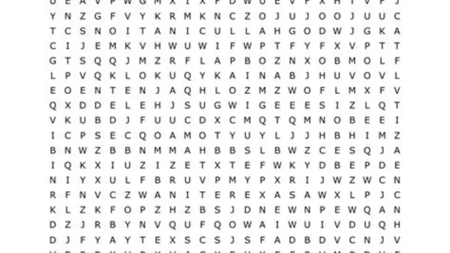
Word search puzzles for macular degeneration require font sizes of at least 18-24 points, high contrast (light background with dark letters), short word lists, and simple layouts with ample spacing to reduce eye strain and enhance readability.
On this page (8 sections)
- Key takeaways
- Ideal font size and style for macular degeneration
- Contrast and color settings that improve readability
- Word length and list size suited for low vision
- Layout features that reduce eye strain and enhance focus
- Word search puzzles for people with macular degeneration
- Recommended tool for making large print puzzles quickly
- Questions people still ask
Part of our guide on large print word search printable for seniors
| Font size | 18-24 pt |
|---|---|
| Contrast ratio | High (7:1 or more) |
| Word length | 5-8 letters |
| Word list size | Under 20 words |
| Letter spacing | Wide spacing |
| Puzzle layout | Simple, uncluttered |
Key takeaways
- Use font sizes between 18 and 24 points for clarity.
- Choose high contrast color schemes, like black on white or yellow backgrounds.
- Limit word lengths to 5–8 letters and keep lists under 20 words.
- Use wide letter spacing and simple, focused layouts.
- Avoid cluttered puzzles and long rows of letters.
Ideal font size and style for macular degeneration
Font size is crucial to word search puzzle readability for people with macular degeneration. Text smaller than 18 points often causes significant strain, while fonts between 18 and 24 points improve visibility and reduce headaches under normal indoor lighting.
Choosing the font style matters. Sans-serif fonts like Arial or Verdana generally work better than serif fonts because their simpler, open letterforms are easier to distinguish when vision is impaired.
Bold weight enhances letter clarity, but too heavy a weight can blur edges. Aim for medium to semi-bold fonts. Avoid decorative or script fonts, which may confuse letter shapes and slow down word recognition.
- Font size: 18-24 points recommended
- Font style: Clear sans-serif fonts
- Font weight: Medium to semi-bold preferred
- Avoid script or ornamental fonts
Contrast and color settings that improve readability
For macular degeneration, high contrast between letters and background is key. A contrast ratio of at least 7:1 is recommended to ensure letters stand out clearly. Black text on a white or light yellow background usually works best. It helps to understand how to improve word search readability before going further.
Avoid complex or low-contrast color combos like gray on white or red on green, which blend and obscure letters. Matte paper can reduce glare, aiding visibility further.
Some people prefer warm backgrounds such as creamy yellows or soft light blues, which reduce harshness without sacrificing contrast. Test with the individual if possible, as personal sensitivity varies.
Additionally, lighting conditions greatly influence perceived contrast. Under dim or uneven lighting, even high-contrast puzzles can become challenging to read. For best results, use bright, diffuse lighting sources positioned to minimize reflections and shadows on the puzzle surface. A desk lamp with adjustable brightness can help tailor illumination to individual needs. We go through easy word search for seniors with large print step by step elsewhere on the site.
Color preferences may also vary with the type of macular degeneration and stage of vision loss. For example, some individuals with advanced stages report better legibility using off-white backgrounds instead of pure white, as this reduces glare without sacrificing contrast. Testing various background hues in the pastel range is advisable to find the optimal balance.
- Contrast ratio: minimum 7:1
- Best combos: black on white or pale yellow
- Avoid low contrast or clashing colors
- Matte paper reduces glare
Word length and list size suited for low vision
Long words increase difficulty since they require scanning more letters, which can strain low vision. Word lengths of 5 to 8 letters strike the best balance between challenge and readability.
Keep the word list size manageable. Lists over 20 words clutter the puzzle and force readers to find too many words, reducing enjoyment and increasing fatigue. Before you commit to anything, it is worth looking at bold grids for easy puzzle solving.
Using thematic, familiar words also speeds recognition. Avoid obscure or very similar words that force rereading, causing frustration and eye strain.
Word frequency in everyday language also affects difficulty. Using common, high-frequency words between 5 and 8 letters enhances recognition speed and reduces frustration. For instance, words like 'garden' (6 letters) or 'market' (6 letters) are easier than rare or technical terms of similar length.
An example puzzle with 18 words all 5 to 8 letters long, such as 'circle', 'planet', and 'stream', allows for a satisfying challenge without overwhelming the solver. This size keeps the puzzle compact while being mentally stimulating, striking a good balance for macular degeneration users. It helps to understand themed word searches for older adults before going further.
- Word length: 5-8 letters ideal
- Word list: 15-20 words maximum
- Use familiar, thematic words
- Avoid similar or complex words
Layout features that reduce eye strain and enhance focus
A simple layout with ample spacing between letters and words reduces crowding, a common source of eye fatigue. Letter spacing should be at least twice the font width to aid letter identification.
Avoid large blocks of letters without line breaks. Instead, puzzle grids of around 12x12 letters balance complexity and readability well.
Provide clear, separate word lists adjacent to the puzzle. Use large, bold headings and put answer keys on a separate page to encourage focus without clutter.
Line spacing between rows within the puzzle grid should be at least 1.5 times the letter height to prevent crowding and facilitate smooth scanning from left to right and top to bottom. For example, with 20-point font, line spacing of about 30 points helps maintain clarity.
Avoid mixing uppercase and lowercase letters in the puzzle grid as consistency aids recognition. Using all uppercase letters simplifies shapes and reduces confusion, but some people find all lowercase less visually taxing. Testing both formats can help determine personal preference.
- Letter spacing: at least double normal width
- Grid size: around 12x12 letters
- Clear, separate word lists
- Answer keys separate from puzzle
Word search puzzles for people with macular degeneration
To create or find word search puzzles suitable for macular degeneration, start by selecting puzzles with fonts 18 points or larger, high contrast, and simple layouts as described.
When printing, always set printer settings to the highest resolution and matte finish if possible to minimize glare and maintain crisp edges.
If you want to create your own puzzles quickly, consider an online tool that specializes in large-print puzzles, which lets you set font sizes, spacing, and themes without complex design software.
Alternatively, free puzzle generators often allow font size adjustment though their large-print options can be limited. Manual editing in a text or design program may be needed to enlarge fonts or simplify layouts.
- Choose puzzles with 18-24 pt font and high contrast
- Print on matte paper with high resolution
- Use large-print puzzle creation tools for custom puzzles
- Free generators may need manual font size adjustment
Recommended tool for making large print puzzles quickly
BigPrint Puzzle Studio helps you create word search puzzles in font sizes 16, 20, or 24 points with good spacing and contrast options suited for older adults with vision challenges.
It generates ready-to-print puzzle books including answer keys and page numbers, saving you hours compared to manual layout. Themes and word lists are built in, simplifying creation.
However, it’s not a medical tool and does not customize puzzles specifically for macular degeneration beyond the large-print format. You still need to choose word length and contrast carefully.
As an alternative, free online word search makers exist but often require manual resizing and formatting, taking more time and technical skill.
- Easy large-print puzzle creation with 16-24 pt fonts
- Includes themed word lists and answer keys
- Saves time over manual editing
- Not specialized for medical vision needs
- Quick creation of large-print puzzles
- Includes puzzle book formatting
- Built-in word themes and answer keys
- Limited customization for vision-specific needs
- Requires purchase
- Not a medical or therapeutic tool
Questions people still ask
Can I use regular word search puzzles for someone with macular degeneration?
Regular puzzles often have small fonts and low contrast, making them hard to read. Choose or create puzzles with at least 18-point font and high contrast for accessibility.
What paper type is best for printing puzzles for low vision?
Matte paper is best because it reduces glare and reflections, which strain eyes more than glossy finishes.
Are dark backgrounds with light text better for macular degeneration?
Most with macular degeneration prefer light backgrounds with dark text for clarity, but some find reversed contrast easier. Test to see what works for the individual.
Is there a recommended word list size for ease of use?
Keep word lists under 20 words to avoid overwhelming the solver and to reduce scanning effort.
Can I enlarge puzzles from regular print to large print by zooming on a screen?
Zooming may help but can degrade print quality and cause layout issues. Printed puzzles specifically designed at large print sizes are better.