Extra large print word search: minimum 24-point font for low vision readers
Get clear, easy-to-read word searches with minimum 24-point font and proper spacing for low vision readers.
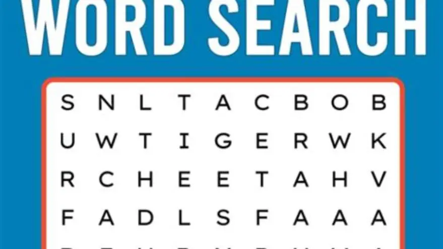
For low vision readers, word searches should use a minimum font size of 24 points, with generous spacing and high contrast to ensure readability and ease of use.
On this page (8 sections)
- Key takeaways
- Minimum font size suitable for low vision word searches
- How spacing and layout aid readability in large-print word searches
- Where to find free printable extra large word searches
- How to create your own extra large print word searches manually
- BigPrint Puzzle Studio as a tool for creating large print puzzles
- Extra large print word search for low vision readers: what to prioritize
- Questions people still ask
Part of our guide on large print word search printable for seniors
Find and print word searches with at least 24-point font and clear layouts specifically designed for low vision readers’ ease.
| Minimum font size | 24-point |
|---|---|
| Recommended spacing | 1.5x letter width |
| Contrast | High black on white |
| Printable sources | Free online sets |
| Recommended tool | BigPrint Puzzle Studio |
Key takeaways
- Use at least 24-point font size for clarity
- Spacing between letters and lines improves readability
- High contrast black-on-white print is best for visibility
- Free printable extra large word searches are available online
- Tools like BigPrint Puzzle Studio simplify creating accessible puzzles
Minimum font size suitable for low vision word searches
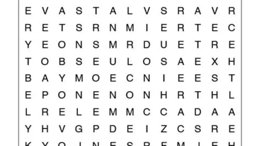
A minimum font size of 24 points is necessary for word searches intended for readers with low vision. This size balances legibility with manageable page layouts, ensuring letters are distinct without overwhelming the puzzle grid.
Fonts smaller than 20 points often cause strain and reduce engagement, especially for users with common age-related vision impairments such as macular degeneration or cataracts. Increasing font size beyond 24 points improves clarity but may reduce the puzzle’s word count per page.
Choosing a clear, sans-serif font like Arial or Verdana at 24 points helps characters remain distinguishable. Bold weights add further definition without overcrowding. Lower contrast or decorative fonts can negate the benefits of large sizing.
While 24 points is the recommended minimum, some readers with more severe low vision might benefit from font sizes up to 30 or 36 points. This increase improves letter distinction further but requires careful adjustment of the puzzle layout to prevent excessive page length or reduced word count. We go through themed word searches seniors step by step elsewhere on the site.
To confirm suitability, test the font size by printing a sample puzzle and having the target reader attempt it under typical lighting. If letters appear fuzzy or cause squinting, a larger font or bolder weight may be necessary. This practical check ensures that the font size meets actual user needs, not just theoretical guidelines.
How spacing and layout aid readability in large-print word searches
Spacing letters and lines wider than normal is just as important as font size. For low vision, a spacing of about 1.5 times the letter width between characters prevents crowding and makes scanning easier.
Line spacing set similarly wide avoids confusion of adjacent rows. Margins should be generous to prevent page edge glare and allow focus on puzzle content. We go through word search easy large print seniors step by step elsewhere on the site.
Layout with simple grids avoids complex overlapping or diagonal word arrangements that can confuse users. Clear answer keys with large print also help maintain confidence in completion.
High contrast—typically black letters on white or cream backgrounds—maximizes visibility in various lighting conditions without glare.
The use of wider spacing should also consider the overall puzzle size; too much spacing can cause puzzles to span multiple pages, which may overwhelm or confuse some users. A balance between clarity and manageable puzzle dimensions is essential. It helps to understand puzzles for macular degeneration before going further.
Another effective layout technique includes the use of distinct borders or shading around the puzzle grid and the word list. This visual separation helps low vision readers quickly locate and focus on different sections without distraction or confusion.
| Spacing Type | Recommended Measurement | Effect on Readability |
|---|---|---|
| Letter spacing | 1.5x letter width | Reduces crowding, easier letter recognition |
| Line spacing | 1.5x line height | Prevents line merging, clearer scanning |
| Margins | At least 0.5 inch | Improves focus, reduces edge glare |
| Contrast | Black on white/cream | Maximizes letter visibility |
Where to find free printable extra large word searches
Various websites offer free printable word searches specifically formatted for older adults and low vision readers. These typically use 24-point or larger fonts and apply proper spacing as described.
Many free sources come from senior activity organizations, libraries, or health-related nonprofits. PDFs designed for printing maintain layout integrity without requiring special software. The other half of this decision is large grid sudoku and word search.
Be cautious of puzzles that look large but use small fonts or tight spacing masquerading as ‘large print.’ Always check the font size in the printable preview before printing.
If you want more control or themed puzzles, free online puzzle generators often allow font and spacing adjustments. However, not all produce truly accessible results without manual tweaking.
When selecting free printable puzzles, also consider the source’s reputation for accessibility. Some websites tailor puzzles specifically for seniors with vision impairments and may provide user feedback or reviews indicating font size and layout effectiveness.
If a printed puzzle appears too dense or the letters seem cramped despite a stated font size, it might be due to tight kerning or minimal line spacing. Zooming in on the PDF preview and measuring with a ruler can reveal if these issues exist before wasting paper and ink.
- Senior center websites often provide free large-print puzzles.
- PDF downloads preserve font size and layout when printed.
- Online puzzle makers can customize font size if settings allow.
- Verify minimum 24-point font by zooming in on previews.
How to create your own extra large print word searches manually
Making your own large print word searches manually requires starting with a word list and a grid layout template. Use a word processor or spreadsheet software where you can set font size explicitly.
Set the font size to at least 24 points and choose a clear font like Arial or Verdana. Adjust column widths and row heights to accommodate wider letters and ensure spacing is 1.5 times the letter width.
Create a simple grid where words are placed horizontally or vertically but avoid dense diagonal or backward arrangements that complicate reading.
Proofread by printing a test page. Check that letters are clear at arm’s length and that the puzzle grid fits on a standard letter or A4 page without crowding.
If manual layout feels cumbersome, consider using free puzzle generator websites that allow font size control or tools like BigPrint Puzzle Studio for easier creation.
A worked example: Suppose you want to place the word 'APPLE' horizontally in your grid. At 24 points, each letter might be roughly 0.3 inches wide. Spacing 1.5 times letter width means 0.45 inches between letters, totaling about 2.25 inches plus 4 spaces of 0.45 inches for spacing, resulting in a word length of approximately 4.05 inches. Adjust column width accordingly to prevent overlap.
Proofreading should include checking for font consistency across the puzzle and answer key. Inconsistent font sizes or styles can confuse or frustrate low vision readers. A good check is to view the printed page under low ambient light to verify legibility in less-than-ideal conditions.
- Prepare a themed word list relevant to your audience.
- Open a word processor or spreadsheet and set font to 24-point or larger.
- Create a grid with cells sized to fit large letters with spacing.
- Insert words horizontally and vertically, leaving blank spaces around.
- Print a test page and verify clarity and spacing.
- Adjust and finalize layout before printing copies.
BigPrint Puzzle Studio as a tool for creating large print puzzles
BigPrint Puzzle Studio is an online tool designed to quickly create large-print puzzle books for seniors, including word searches with 16, 20, or 24-point fonts. It streamlines the creation process, ideal if you need multiple puzzles or themed books.
You can choose from ready-made word lists or enter custom words, and the software automatically generates printable puzzles with large fonts and clear layouts. It includes answer keys and page numbering tailored for seniors and low vision readers.
The limitation is that the tool focuses on activity creation, not medical or therapeutic solutions, so it suits those making engaging content rather than clinical interventions.
For caregivers or activity directors needing quick puzzle generation without manual formatting hassles, this is a good option. Alternatively, free online generators or manual layout remain valid approaches if you prefer no-cost or more control.
- Saves time creating large-print puzzles
- Includes large font size options up to 24 points
- Offers themed word lists and custom entries
- Generates ready-to-print puzzle books with covers
- No medical or vision therapy features
- One-time purchase required
- Less control than fully manual design
- Needs basic computer comfort to operate
Extra large print word search for low vision readers: what to prioritize
When choosing or creating an extra large print word search for low vision, prioritize 24-point font minimum, wide letter and line spacing, and high contrast printing.
Avoid overcrowded grids, fancy but confusing fonts, or colors that reduce contrast. Functionality beats artistic flair for accessibility.
Free printable puzzles can meet these needs if you verify the font size and layout carefully. Otherwise, tools like BigPrint Puzzle Studio can produce high-quality, accessible puzzles more quickly.
Accessible puzzles improve participation, satisfaction, and mental stimulation for older adults with vision challenges, making the attention to font size and layout worth the effort.
Questions people still ask
Why is 24-point font the minimum for low vision word searches?
24-point font ensures letters are large enough for readers with common vision impairments to identify without strain. Smaller fonts increase fatigue and errors.
Can I use colored fonts instead of black for better visibility?
High contrast is key. Black fonts on white or cream backgrounds provide the clearest visibility. Colored fonts may reduce contrast and hinder readability.
Are all large print puzzles suitable for people with low vision?
Not necessarily. Some large print puzzles have sufficient font size but poor spacing or low contrast, which make them difficult to use despite the font size.
How can I verify font size before printing a puzzle?
Open the puzzle file on your computer and zoom in to measure letters against a ruler or known reference. Alternatively, check the document properties or puzzle creator settings.
Is BigPrint Puzzle Studio expensive compared to free options?
It requires a one-time purchase but offers features that save time creating large print puzzles. Free options exist but may require more manual effort and offer less polish.
Ready to try it? It automates creating large-print puzzles with minimum 24-point fonts, saving time and ensuring accessibility for low vision readers.
Create large print puzzles