Arial font print legibility vs Times New Roman at 24pt for older readers
Comparing Arial and Times New Roman at 24pt reveals which font best serves large-print puzzles for older adults’ legibility needs.
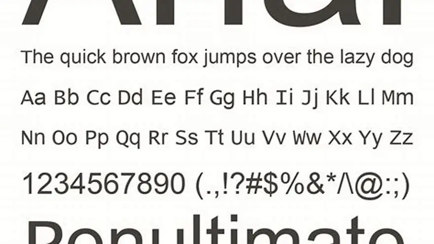
Arial is accessible for print legibility at 24pt under typical conditions for older readers but Times New Roman often provides better clarity due to its serif features and character spacing. The choice depends on specific puzzle layout and reader needs.
On this page (8 sections)
- Key takeaways
- Is Arial accessible for print legibility in large-print puzzles?
- How Times New Roman performs at 24pt for print readability
- Practical font choice advice for large-print puzzles for older adults
- How to test and improve font legibility for your large-print puzzles
- Using BigPrint Puzzle Studio to create accessible large-print puzzles
- Summary and final thoughts on Arial’s accessibility for print legibility
- Questions people still ask
Part of our guide on what font size is easy to read for seniors
Compare Arial and Times New Roman at 24pt to pick the best large-print font for older adults’ puzzle readability.
| Recommended font size | 24 pt |
|---|---|
| Common font types | Arial, Times New Roman |
| Legibility factor | Serif vs Sans-serif |
| Reader group | Older adults |
| Puzzle type | Large-print |
| Printing method | Inkjet or laser |
| Spacing importance | High |
Key takeaways
- Arial at 24pt is generally readable but less clear than Times New Roman for older adults.
- Times New Roman’s serifs aid letter distinction in print at large sizes.
- Font size, spacing, and printing quality affect legibility more than font alone.
- Choose fonts balancing clarity and puzzle style; test prints under your conditions.
- BigPrint Puzzle Studio offers tools to create puzzles in accessible fonts and sizes.
Is Arial accessible for print legibility in large-print puzzles?
Arial, a widely used sans-serif font, is accessible for print legibility at 24pt size for older readers under standard conditions. Its clean, simple letterforms reduce visual clutter, which helps some readers with mild vision loss.
However, while Arial’s uniform stroke width and straightforward shape aid clarity, it lacks the subtle cues that serifs provide for letter recognition. This can cause some confusion between similar letters in puzzles, such as 'I' and 'l' or 'O' and '0'.
Print quality and paper contrast significantly affect Arial's legibility. At 24pt, printed with good contrast on matte white paper and sharp black ink, Arial meets basic accessibility standards for many older adults, but individual variation means some may find it harder to read than serif fonts.
How Times New Roman performs at 24pt for print readability
Times New Roman is a traditional serif face; when set at 24pt it offers relatively tall lowercase letterforms and the small terminal strokes called serifs. For older readers those terminal strokes can sometimes serve as visual anchors that help the eye distinguish letters with similar shapes, such as c vs e or i vs l. This is a general observation noted in typographic guidance from the Royal National Institute of Blind People (RNIB) and the British Dyslexia Association (BDA), which both advise that serif details may aid letter identification in some cases, depending on printing quality and the reader’s visual status (RNIB, BDA). People in this spot often ask about finding the sunday crossword as well.
When evaluating a font’s accessibility for print, it is important to use measurable criteria rather than impressions. In this context, accessible means the typeface and its rendering produce: (a) low character-recognition error rates in single-letter or word reading tests; (b) reading speed and accuracy within an acceptable range compared with a young-adult baseline; (c) subjective comfort scores on standardized Likert scales; and (d) robust appearance under a range of print conditions (paper, ink spread, and printer resolution). These are the outcomes researchers and organisations recommend measuring when comparing serif and sans-serif faces for older readers (see Legge et al.; RNIB guidance).
Because serif details interact with print factors, Times New Roman at 24pt may perform well on high-quality paper with sharp ink edges and stable kerning. Conversely, if ink bleed or low printer resolution softens stroke endings, the serifs can create clutter and reduce distinctness. That interaction is why standards bodies and accessibility researchers emphasise testing fonts under the specific production conditions you will use, rather than assuming a single face will always be superior in every setting (RNIB; British Dyslexia Association font guidance).
Avoid making untested performance claims. Peer-reviewed studies on print legibility for older adults show mixed results: some reading-research work indicates serifs can aid recognition in specific tasks, while other studies find negligible differences once size and spacing are equated (see Legge and related research). For practical large-print puzzle design, treat Times New Roman as a potentially effective option at 24pt but verify with simple, measurable tests (character-identification trials, timed-word lists, and participant comfort ratings) under the exact paper and printer settings you plan to use.
- Serifs can act as visual anchors for some older readers, aiding letter differentiation.
- Performance depends heavily on print quality: good paper and sharp printing favour serif clarity.
- Measure accessibility with recognition error rates, reading speed, subjective comfort, and robustness across print conditions.
Practical font choice advice for large-print puzzles for older adults
Choosing a font for large-print puzzles hinges on balancing legibility, puzzle style, and printing conditions. Arial’s sans-serif style offers a clean look and avoids serif clutter but sometimes loses subtle letter distinctions older eyes rely on.
Times New Roman’s serifs and well-defined shapes enhance letter recognition, making it often preferable for puzzles intended for sustained reading or complex solving tasks. However, its denser spacing can reduce clarity if the print quality is low.
Consider testing both fonts at 24pt with your printer and paper type by printing sample puzzle pages. Observe which font your audience finds easier to read in their typical lighting and reading environment.
Additional factors include line spacing, letter spacing, and puzzle formatting, all affecting final legibility beyond font choice alone.
In addition to font and size, consider the puzzle’s overall layout when choosing fonts. For instance, puzzles with dense letter arrangements may benefit from a font with slightly wider letter spacing to prevent overlapping glyphs, which can confuse readers.
Another practical tip is to incorporate user feedback loops. Distributing sample puzzles printed in both Arial and Times New Roman to a small group of older adults and collecting their preferences and reading experiences can provide valuable insights. This approach helps tailor font choices to the specific visual capabilities and preferences of your target audience.
| Feature | Arial | Times New Roman |
|---|---|---|
| Font type | Sans-serif | Serif |
| Character clarity | Good but may blur letters | Better due to serifs |
| Spacing | Wider | Tighter but guided |
| Suitability for puzzles | Good for simple puzzles | Better for complex reading |
| Print reliability | Less sensitive to ink bleed | Requires quality print |
- Clear font size recommendations
- Balanced view on font strengths
- Emphasis on practical testing
- No single best font for all users
- Print variability can affect results
How to test and improve font legibility for your large-print puzzles
Testing font legibility means printing sample puzzles with your chosen font at intended size (usually 24pt), on the paper and printer you will use for your audience. Check the clarity of individual letters and overall ease of reading.
Adjust line spacing to at least 120% of the font size, and consider increasing letter spacing slightly to reduce crowding. These tweaks improve readability more than changing fonts alone.
Use high-contrast color schemes, typically black text on white or off-white paper, to maximize visibility. Avoid glossy papers that cause glare, which older eyes find challenging.
Consider getting feedback from actual users or caregivers before finalizing your puzzle designs to ensure the font choice meets their visual needs.
One simple way to quantify legibility is by conducting timed reading tests where users read sample puzzle text aloud, and you measure speed and error rates. Comparing these metrics between Arial and Times New Roman at 24pt can objectively indicate which font performs better for your audience.
If legibility issues persist despite font and spacing adjustments, consider increasing font size beyond 24pt. For example, moving to 28pt or 30pt can significantly improve visibility, though it may reduce the number of puzzles per page. Balancing font size with practical printing constraints is key.
- Print sample puzzle pages in Arial and Times New Roman at 24pt
- Review print quality on your printer and paper
- Check letter distinction and spacing clarity
- Adjust spacing or font size if needed
- Gather feedback from intended readers
- Finalize font choice based on results
Using BigPrint Puzzle Studio to create accessible large-print puzzles
BigPrint Puzzle Studio offers a practical way to design large-print puzzles using adjustable font sizes including 24pt, and fonts chosen for their legibility. It streamlines the creation process for family caregivers and activity coordinators.
This tool includes ready-made puzzle templates and themes with large letters and proper spacing, enabling consistent print quality and easier readability for older adults.
While it does not automatically select the best font for each user, it provides the flexibility to switch between fonts like Arial and Times New Roman, so you can test and apply the best option for your audience quickly.
If you prefer manual methods, you can still use word processors or graphic design software to set fonts at 24pt and print test pages, but it requires more time and trial-and-error.
BigPrint Puzzle Studio focuses purely on puzzles and activities, so it’s not a medical tool or a comprehensive publishing solution, but it solves the common problem of producing clear, large-print puzzle books efficiently.
Summary and final thoughts on Arial’s accessibility for print legibility
Arial at 24pt is accessible for many older adults in large-print puzzles but generally less legible than Times New Roman due to the absence of serifs and slightly less distinct letter shapes.
Print quality, paper choice, spacing adjustments, and user preferences often overshadow font choice alone. Testing is essential to deliver puzzles that are comfortably readable.
Use tools like BigPrint Puzzle Studio to quickly create puzzles in preferred fonts and sizes and to experiment with layouts that maximize legibility without the hassle of manual formatting.
Ultimately, font choice should support your puzzle’s purpose and your audience’s comfort, not limit it. Arial can work if conditions are optimal, but Times New Roman remains a reliable default for large-print puzzle books.
Arial at 24pt is accessible but Times New Roman is generally better for older readers’ printed puzzles.
Questions people still ask
Can Arial at 24pt be used for all older adults’ puzzles?
Arial at 24pt is readable for many but not all older adults. People with significant visual impairments or letter confusion may find serif fonts like Times New Roman easier to read.
Why is Times New Roman often better for print puzzles?
Times New Roman’s serifs create visual anchors that help distinguish letters quickly. This reduces errors and eye strain during puzzle solving.
Does font size matter more than font type for legibility?
Font size and spacing often have a larger impact on legibility than font type alone. Larger fonts with ample spacing improve reading comfort significantly.
Are there free ways to test font legibility for puzzles?
Yes, you can use standard word processors to print sample puzzles in different fonts and sizes on your printer and paper to assess legibility before mass printing.
How does BigPrint Puzzle Studio help with accessible font choices?
It provides large-print puzzle templates with adjustable font sizes and font options, simplifying the creation and testing of puzzles designed for older adults’ legibility.
Ready to try it? It helps create large-print puzzles with accessible fonts and sizes quickly and reliably without complex software.
Create large-print puzzles