How to design themed large-print word searches with readable fonts and grids
Step-by-step guidance on making themed large-print word searches with readable fonts and layouts designed for seniors and easy printing.
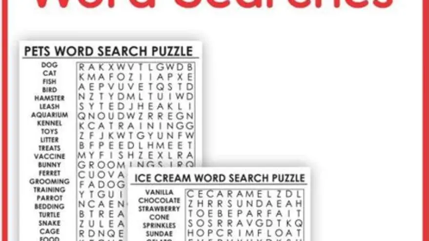
To make themed large-print word searches, pick a clear theme, select a word list of about 10-20 words relevant to it, use fonts sized 16-24 points, create a grid with at least 15x15 cells, arrange words clearly without clutter, and export as high-contrast PDFs suitable for seniors.
On this page (8 sections)
Part of our guide on how to make large print puzzle books for kdp
Create themed large-print word searches using clear fonts and well-spaced grids designed specifically for easy reading by seniors.
| Font size | 16-24 pt |
|---|---|
| Grid size | 15x15 cells minimum |
| Word list length | 10-20 words |
| PDF contrast | High contrast recommended |
| Print format | Standard letter or A4 |
Key takeaways
- Choose a focused theme with 10-20 related words to keep puzzles manageable
- Use sans-serif fonts sized 16-24 pt for optimal readability by seniors
- Create grids with at least 15x15 cells to fit words comfortably
- Arrange words for clarity: straight lines and spacing reduce confusion
- Export puzzles as high-contrast PDFs optimized for printing
Selecting a theme and word list
Choose a theme focused enough to generate around 10-20 words. For seniors, familiar or nostalgic topics work best, such as holidays, nature, or common hobbies. A longer list clutters the puzzle and reduces clarity.
Words should be clear and unambiguous, avoiding complex or unusual vocabulary that may confuse or frustrate solvers. The list should include straightforward nouns and verbs related to the theme.
Organize the word list alphabetically or by length to help with arranging them later. Use a simple text editor or spreadsheet to manage your list efficiently.
Consider including synonyms or related words to expand the word list subtly without overwhelming the puzzle. For example, if the theme is "gardening," words like "plant," "soil," and "weed" complement each other without redundancy. This helps keep the puzzle engaging. Additionally, verify that words do not have unusual plural forms or ambiguous spellings, as these can confuse solvers, especially seniors who may rely more on clear and predictable vocabulary. We go through black and white 8.5x11 puzzle layout step by step elsewhere on the site.
When selecting words, take into account cultural and regional differences that may affect word recognition. For instance, a word common in American English might be less familiar to seniors in the UK or Australia. Tailoring the word list to the audience’s background increases accessibility and enjoyment. To double-check your word list, you can run a quick test by asking a few seniors or members of your target group if the words seem appropriate and recognizable.
Choosing large readable fonts
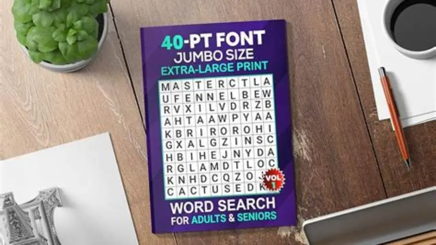
Fonts sized from 16 to 24 points are generally readable by older adults with low vision, with 20 pt being a balanced choice for word searches. Use sans-serif fonts like Arial, Verdana, or Tahoma because they reduce letter confusion.
Avoid decorative or condensed fonts that reduce legibility. Bold weights improve clarity, but too heavy a font can crowd letters, so test print a sample before finalizing. If that sounds like your situation, read up on themed puzzles for seniors next.
If making printables, ensure the font is embedded in PDFs to avoid substitution on different devices or printers.
The choice of font weight can affect legibility in subtle ways. While bold fonts improve visibility, fonts that are too heavy can cause letters to merge and reduce readability. A weight categorized as semi-bold often strikes a good balance. Test printing the font at the intended size and weight on the target paper type is essential to confirm clarity before finalizing.
Letter spacing (tracking) also plays a critical role in readability. Increasing spacing slightly beyond default values, for example by 5-10%, can prevent letters from appearing cramped, especially at larger sizes. This adjustment is particularly helpful for letters with similar shapes, like 'O' and 'Q' or 'I' and 'L'. Experiment with spacing in your design software or word processor to find the most readable setting. It helps to understand word search book large print before going further.
Avoid fonts with serifs because the small embellishments can blur at larger sizes when printed on lower quality paper or with home printers. Sans-serif fonts with open counters and clear distinctions between similar letters are most effective. For example, Arial and Verdana are preferred over fonts like Times New Roman or Garamond in large-print puzzles.
- Font size: 16-24 pt for letters and word list
- Font style: simple sans-serif fonts
- Font weight: regular to bold, avoid too heavy
- Improved legibility for seniors
- Reduces eye strain
- Simple fonts widely supported in software
- Larger fonts increase page size
- Limited decorative options
- May reduce number of words per page
Creating the puzzle grid
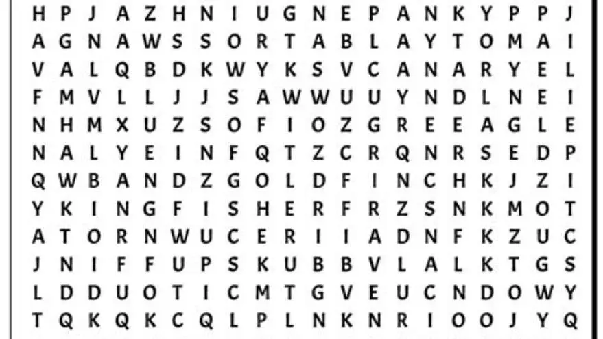
Design grids typically at least 15x15 cells to comfortably fit 10-20 words, with a cell size of about 0.5 to 0.6 inches square for big letters. Larger grids prevent crowding and make letter spacing consistent.
Use square cells with visible but not overpowering grid lines in high contrast (black on white) to separate letters visually without distraction. If that sounds like your situation, read up on how to make a word search book without canva next.
Keep the grid symmetrical when possible to aid visual scanning and make puzzles inviting to seniors.
When determining grid size, consider the balance between puzzle complexity and letter size. Increasing the grid beyond 15x15, such as 20x20 cells, allows for more words or longer words but requires careful font size adjustment to maintain readability. For very large fonts (22-24 pt), a 15x15 grid usually suffices to avoid excessive page size or multiple pages.
Grid line thickness should be chosen to enhance separation without creating visual noise. Lines around 0.5 point thickness generally work well. Using lighter gray lines can sometimes reduce visual clutter while still guiding the eye. Testing different line weights on sample prints ensures the best balance. We cover readability tips for seniors in its own article.
If you plan to allow solvers to mark found words with pens or highlighters, leave enough space around the grid edges and between rows for comfortable marking. A margin of at least half an inch outside the grid helps prevent smudging or crowding when users write their answers.
Arranging words for clarity
Place words mostly in straight lines — horizontal, vertical, or diagonal — avoiding zigzags or backward words. Straight lines are easier for seniors with cognitive or visual impairments.
Space words apart to avoid overlap and letter confusion. Keep unused grid cells filled with random letters but in a contrasting color or lighter shade to reduce clutter perception. People in this spot often ask about how to sell printable puzzles on etsy as well.
Test print the puzzle and check that word placement is clear and that the word list is easily cross-referenced.
To further aid clarity, avoid placing too many words that intersect at the same letter. Excessive crossing points can create confusion and visual clutter. Aim for a maximum of two or three intersections per word. This makes each word easier to trace and reduces cognitive load.
For puzzles targeting seniors, limit the use of backward or reverse word placement. While some moderate challenge is good, excessive backward words can frustrate solvers with mild cognitive impairments or visual difficulties. Instead, favor forward and diagonal placements that are more intuitive.
After arranging words, simulate solving the puzzle yourself or with a test group. Check that words can be located without excessive searching and that the word list is easy to use as a reference. Marking found words during this test helps identify any confusing layouts or ambiguous letter patterns.
- Arrange longest words first to set layout
- Fit medium and shorter words around them
- Avoid crossing words at the same letter repeatedly
- Fill empty cells thoughtfully to avoid confusion
Making printable PDFs suitable for seniors
Export puzzles as PDFs at standard letter (8.5x11 inches) or A4 size with at least 300 dpi resolution for crisp print quality. High resolution ensures sharp letters and grid lines.
Use black text on white background or the highest contrast colors you can find. Avoid pastels or muted colors which reduce readability.
Add page numbers and an answer key on a separate page to aid users and caregivers. Keep margins wide enough to prevent cutting off letters during printing.
Consider embedding instructions or tips on the puzzle page itself to assist seniors who may be unfamiliar with word search conventions. Simple guidance like "Circle words in any direction" or "Words do not overlap" can reduce frustration. Use a font size no smaller than 14 pt for instructions to keep them accessible.
For answer keys, highlight found words clearly using bold fonts or color highlighting while maintaining overall high contrast. Placing the answer key on a separate page prevents solver temptation but provides easy access for caregivers or group facilitators.
Before finalizing the PDF, conduct a test print using a standard home printer and view it under different lighting conditions. This ensures that the contrast and font sizes remain effective in real-world environments, which may vary widely for senior users. Adjust margins and scaling if any letters appear cut off or too small.
How to make themed large-print word searches
Combine the steps: start with a theme and word list, select a large readable font (16-24 pt), design a 15x15 or larger grid with clear spacing, arrange words in straight lines for clarity, then export as a high-contrast PDF.
Manual methods include using spreadsheet software (like Excel) to build grids and place words, then exporting as PDF. This requires patience and trial-and-error for spacing and legibility.
Alternatively, use dedicated tools such as BigPrint Puzzle Studio, which automates grid creation, font sizing, word placement, and PDF export optimized for older adults. It offers theme templates and adjustable print options, saving time and reducing errors, though it requires a one-time purchase and some familiarity with computer tools.
| Method | Ease of use | Customization | Time required | Cost |
|---|---|---|---|---|
| Manual (spreadsheet + editor) | Moderate | High | Hours | Free |
| BigPrint Puzzle Studio | Easy | Medium-high | Minutes | One-time fee |
Questions people still ask
How many words should I include in a themed large-print word search?
Typically, 10 to 20 words are ideal. This keeps the puzzle clear and not too dense, which helps seniors focus and reduces visual confusion.
What font size is best for seniors in word searches?
Fonts sized between 16 and 24 points balance readability and space. Sans-serif fonts like Arial or Verdana are recommended to improve clarity.
Can I use free tools to create large-print word searches?
Yes. Spreadsheet programs and word processors can be manually adapted to create grids and place words, though it is time-consuming and requires patience.
What grid size works best for large-print puzzles?
A grid of at least 15x15 cells accommodates a moderate number of words with enough space for large letters and clear separation.
How do I make sure my puzzles print well for seniors?
Export puzzles as high-resolution PDFs with high contrast (black on white), use wide margins, and test print before distribution.
Ready to try it? It automates font sizing, grid creation, word placement, and PDF export optimized for seniors, saving time and errors.
Create large-print puzzles easily